Cartographers often debate about how much tone should represent flat areas on a shaded relief. On most maps, flat areas generally contain much denser human development than hilly areas. Therefore, some cartographers don’t apply a tint to flat areas with the noble goal of avoiding visual disturbances with other map elements.
Gray tone fills flat areas.

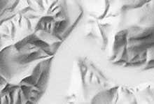
Illuminated hills adjacent to flat areas are barely visible when white fills the flat areas. © swisstopo.
But what happens when white represents flat areas? The shaded relief loses part of its three-dimensional appearance because the hills become tonally isolated from other parts of the relief. Without lowland tone, no connection exists between the shadowed slopes and flat land. And the opposing illuminated slopes are no longer discernible from the flats, which share a similar pale shade of grey or white.
 The example on the left shows low flat land in a slightly darker shade than the higher tableland. This creates a three-dimensional effect, since the illuminated hillsides dominate the overall appearance.